Implementing an SPC programme
Progress indicator
Analysing your organisation’s performance over time can be challenging. Derek Scott, senior Quality Assurance and Quality Control advisor for ICR, explores how to select the best process and examine your data to achieve the best results
As quality professionals, one of the key elements of our jobs is to understand and control variation. Without an understanding of what the natural variance within your process is telling you – the ‘voice of the process’ – it is difficult, if not impossible, to truly have an understanding of your organisation’s performance over any set period of time.
One of the most straightforward ways in which to gain insights into this performance period is to implement a Statistical Process Control (SPC) programme. SPC will allow you to evaluate the data generated by process over a period of time, allowing for conclusions to be drawn, not just about the underlying capability of the process in study, but also to give you advance warning of where the organisation is starting to lose control over its processes. Corrective measures implemented when an SPC programme highlights worrying trends within a process’ performance will almost certainly cost less than if those worrying trends are allowed to continue and, eventually, begin resulting in defects being generated.
So, if you have decided to embark on the implementation of an SPC programme, how best to go about it? Implementing SPC monitoring over every single business processes may neither be practical, nor desirable, so, where resources are limited, focusing attention on the processes that result in a product or service delivery to your organisation’s client will pay dividends. It may also be wise to initiate the programme with a trial implementation of SPC monitoring across one or two product lines to give confidence to yourself in the efficacy of the method under consideration and to prove to senior management the benefits of the methodology that you are, after all, asking them to provide resources for.
"Implementing SPC monitoring over every single business processes may neither be practical, nor desirable"
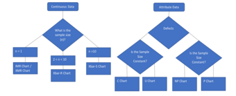
Having selected a suitable product or service, you need to ask of the process: what are the key recordable characteristics – those known as Critical to Quality (CTQ) – that will be under study? Not only that, but you must assess what form the data takes – is it count or attribute data? Furthermore, you must also establish what your sampling plan will be and thus the sample size you will be taking of the data. Consider the way defects affect the process output (i.e. can you have multiple defects in a single unit?) and whether the sample size will remain constant during the course of the programme. All of these factors will affect the choice of control chart that will be appropriate to your process under study. The following diagram will help you to select an appropriate chart when you have established these factors:
Selecting an appropriate control chart

When you have identified your process, the sampling plan and your appropriate control chart, you are now ready to commence the sampling of your process data and, with that, the construction of your control chart from this data.
Each control chart appears somewhat different but they all have essentially the same factors – the display of process data over time between two elements – the upper control limit (UCL) and the lower control limit (LCL). A word of warning on control charts; I have heard the misconception that UCL and LCL are always Three-Sigma from the process mean. This is not so, and you must calculate the control limits using the correct formulae for that specific chart. A fantastic resource for those unsure of how to do this can be located at PQ Systems’ website and this covers the formulae for all the control charts described above.
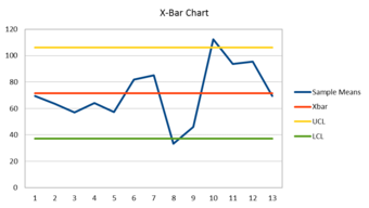
Once control limits and data have been established, a typical chart will likely take on the following appearance:
A typical control chart

With this visualisation of our data we can now start to interpret the voice of the process, focusing on our points of special variation that are producing defects. In Diagram 2 above, we can see on points eight and 10 of the X-axis that our process has exceeded the boundaries of the control limits assigned and, as such, has indicated that our process is not in control. This does not by itself mean these data points are guaranteed defectives – this would be defined by the customer defined specification limits – but does indicate the need for intervention in the process to reduce variation.
Other factors displayed on our chart that might indicate the need for intervention within the process could be nine data points consistently in a row on either side of the centre-line (in the example used, the X-bar), or six data points in a row, steadily increasing or decreasing, or 14 points in a row that alternate. These examples are part of a series of tests that can be applied to your process data to show whether the variation is caused by common cause or special cause variation. Identifying the difference between the two is the only way to avoid the most common mistake in utilising SPC monitoring programmes: intervening to attempt to adjust common cause variation, which will simply result in greater variation and the process slipping further from your control. This is the exact opposite of what an SPC programme should aim to achieve.
Applying these tools to your organisation will be a solid way of helping you to understand what your processes are telling you.
Quality World

Get the latest news, interviews and features on quality in our industry leading magazine.
