Deming Management for Quality (part 3): Decisionology - Statistical Process Control done right
Progress indicator

In the third part of this four-part series on Deming’s System of Profound Knowledge, Alan Clark and Tony Korycki explain how to conduct a proper analysis of data to provide evidence of what is happening in an organisation, as a basis for effective decision-making.
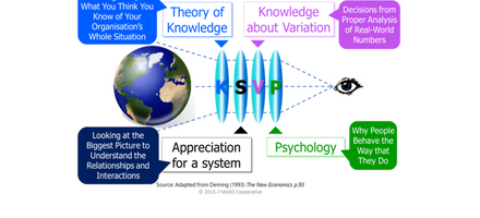
Decisions, decisions. They are at the heart of all activity in organisations, whether reacting to changing circumstances, correcting or compensating for mistakes, or conscious improvement and innovation activities. We can make performance better through understanding. In this third article of the four-part series on W Edwards Deming’s System of Profound Knowledge (SoPK), we look at what he called ‘Understanding Variation.’ This is the foundation for rational decision-making, which overcomes bias by understanding what is happening, and is based upon proper analysis of real-world data. But real-world data is messy and full of apparently random variation. Critically this ‘noise’ (randomness of variation) can hide true ‘signals’ for action.
Let’s look at bias for a moment. Every human being is biased. We may think that we are truly objective and make decisions only based on facts. Unfortunately, this is rarely true. In his book Thinking Fast and Slow, Daniel Kahneman reveals we have two types of thinking: fast, intuitive thinking, and slow, rational thinking. According to Kahneman we spend most of our time unconsciously thinking intuitively and this can influence our rational thinking. This is clearly going to affect our judgment and decision-making. It is true that expert intuition developed through long practice and experience can be reliable. However, it is also true that there are so-called ‘cognitive illusions’ that may lead even experienced experts astray.
All this is highly problematic in the fields of management and quality, in which we constantly need to make effective decisions. Our professional education teaches us to analyse measured data to understand what is happening and provide a rational basis for judgements and decisions. Prudently, expert intuition might well be backed up by measurement evidence. This should, perhaps, come as no surprise to quality professionals schooled in the arts of data measurement and evidence-based decision-making. The most reliable analysis method, widely taught and practiced, is Statistical Process Control (SPC), although this may not be familiar to all.
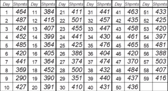
Let’s start by looking at a table of data showing the number of shipments per day from our ficticious case study of ‘WonderWidgets’. As a reminder, issues with their ecommerce website have led to a considerable number of complaints about website usability and late deliveries (see Deming Management for Quality (part 2): Systemology – Everything is connected).

As you can see from the table, the daily output of shipments is varying, and eyeballing the table shows this variation is sizable. However putting data in a table does not help us understand and explain what is happening. Proper analysis would tell us this more clearly. Yet it is extremely common for performance, quality and other data to be presented in tabular format.
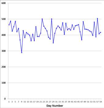
Let us be clear, the purpose of data is action. What effective action can you take after looking at the above table? Not a lot. What SPC does first is to put data into a graph against time – linking each data point to real world events. This helps to identify possible causes for exceptional events, patterns or trends and provides some understanding as a basis for action.

Unfortunately there is a problem. Real world data, like our simulation of WonderWidgets’ shipping performance, is usually full of apparently random variation, similar to what electronic engineers call ‘noise’. It is difficult to decide which points are true ‘signals’ for action. Of course this does not stop some people reacting to every point: “Hurrah! Output is up!”or “Boohoo! Output is down!” And so the blame game can begin, diverting people from taking meaningful action.
Deming advocated using SPC to better understand real world variation in data, and so make better decisions about when and how to take action. The advantage of SPC is that it both presents and analyses data.
Now here’s the critical point about SPC. Deming distinguished between analytic and enumerative statistical studies. In enumerative studies, action is taken on the material in the set being studied. An example might be, say, a one-off random school inspection of performance with the objective of making a ‘judgement of current results’ based on the latest external examinations alone. On the other hand, in an analytic study of, say, delivery performance, the focus is on ‘improvement of the process or system’ which produced the results being studied and that will continue producing results in the future.
The second critical point about SPC is that it does not try to fit theoretical assumptions to the shape of the data distribution, for example the ‘Normal Distribution.’ If you do this, your results will not be as reliable. A great example of SPC is the ‘Individuals and Moving Range’ (XmR) chart.

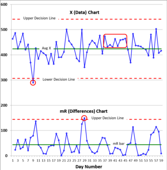
The graphic shows an XmR chart, which is made up of two times series graphs. The top one is the measured shipping data. The lower moving range chart is made up from the differences between successive data points ignorany minus signs. This lower one is the secret to doing SPC right because it provides a more representative measure of the ‘average variablity’ (mR bar).
This mR bar, along with the averages, is then used to calculate the decision lines used to show if signals are present. You can then tell whether: (a) the process is a safe basis for predictions about the future; (b) there are exceptional events that require investigation or action; and (c) known changes have led to improvement.
This XmR chart shows that ‘WonderWidgets’ daily shipments are highly variable. In X there are signals at day nine and a run of eight points on one side of the average (days 37-45). In mR there is a signal at day 29 of an exceptionally large swing in the data. All of these signals should be investigated to understand the causes and could be the basis of rational improvement decisions.
In conclusion, our decisions are all at risk of bias, even within our expert fields. SPC, done right, provides proper analysis of data - giving a rational basis for our decisions.
About the authors: Alan Clark, CQP FCQI, is a Management Development Coach, Advisor and Trainer at Key Business Improvement. Tony Korycki, BA, MSc, is a Service Introduction and Process Architect at BT Global Services.
Call to action
If you would like a worksheet on how to calculate decision lines in an XmR chart please email: [email protected]
Quality World

Get the latest news, interviews and features on quality in our industry leading magazine.


